


Selling the #1 fitness tracker should be easy
...And for the most part, it was. Fitbit products were critically-acclaimed and more popular than ever.
Still, we thought we could do better.
The Fitbit product lineup was growing exponentially, with multiple product launches a year and the introduction of a slew of accessories. Additionally, each new product had more features than a single paragraph of text could convey. So, it was time to give the one-page Store an architectural overhaul and a facelift.

High-level information architecture of the new shopping experience

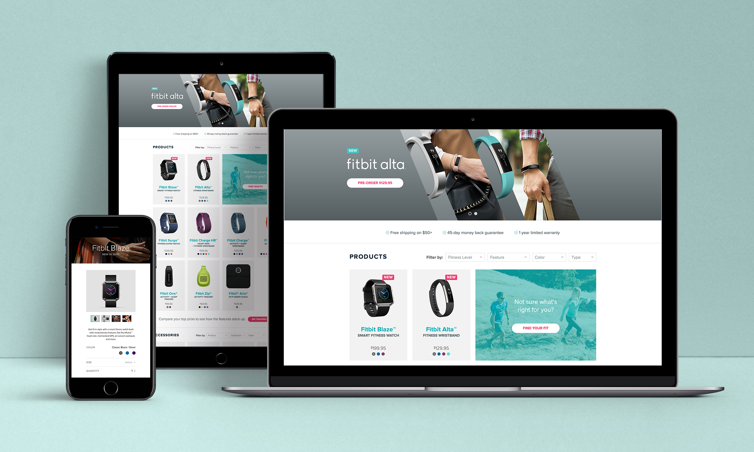
We created an entire shopping ecosystem
The focal point of the shopping experience, the storefront, was massively simplified to reduce information overload. Yet, we introduced tools to allow users to filter products by popular features like heart rate, or take a quiz to understand the best product for them. The addition of dedicated product detail pages vastly expanded the opportunities for marketing and data capture. Plus, we reiterated the awesome benefits of shopping on Fitbit.com on every page.
(And, we did it all simultaneously with the launch of the Fitbit Blaze and Fitbit Alta families.)

Early wireframes of the storefront and a product pdp

Surprise & delight from the moment you click "order"
For the Fitbit customer, the purchase of a fitness tracker or smart scale was the beginning of an exciting journey. So we wanted to celebrate the occasion.
One of the first steps in the customer lifecycle was the order confirmation. So we radically redesigned it to capture the excitement of the purchase. We took all of the transactional emails from a plain-text invoice to a vibrant celebration, worthy of Instagram.